Curious how we make round logos look round on drinkware?
Of course not. But you’ll be surprised at the distorted stuff we gotta do to make round stuff look round on round stuff. n’ stuff.
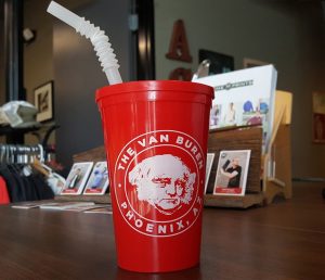
When we get an order for drinkware, like cups, mugs, and bottles, we distort the art so it appears correct on the product, especially for circular art. Printing a round logo on something tapered like a cup will make the logo look like an inverted egg instead of a circle. And unless you sell eggs, you probably don’t want that. Plus, the larger the print is, the more pronounced the effect is.
On something like a water bottle that doesn’t taper, it usually just requires stretching the art a bit (107% is pretty common for us), though stretching the right and left edges a little more than the middle helps it look better due to foreshortening.
But for something tapered, we need to distort the art quite a bit since the bottom needs to be wider than the top. In these images, you can see how we distorted The Van Buren’s logo (the blue line is the original, perfect circle) into a fat egg to offset the usual inverted-egg look, which makes the print appear like a boring ol’ circle. In this case, boring is good. Maybe even eggsellent. 🥚
![]()