Submit art files for review
The Basics
Vector vs. Raster artwork
Raster, or pixel-based, artwork is resolution-dependent; the image quality decreases when scaled up, as the pixels become more visible (pixelation). This is usually for detailed images like photographs or complex textures with gradients. Common file formats are .tif, .psd, .jpg, .gif, .bmp. Vector-based files, instead of having pixels, are made of mathematical paths, allowing them to be scaled to any size without any loss of quality. Most logos, icons, and text are vector. The most common vector file types are .svg, .ai, .eps, .pdf. That covers most anything you’ll come across, but to further confuse things, it’s totally possible to save a raster file as a .pdf, or embed a low-resolution image in an .ai file. So just like people, it’s what’s inside that counts! Not just the file extension. Yep, just like people.File types
We accept most file types. Our preferences depend on the print method and artwork, but usually the following formats are preferred: .pdf, .ai, .eps, .psd, .tif, .svg. We can also accept .jpg, .png, .bmp. Note: no one file type is better than another (wow, how egalitarian of us to say that!) A properly sized .jpg file will print better than a low-resolution image saved as a .pdf.Resolution
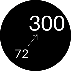
Raster files should be provided at 300dpi (dots per inch, or ppi, pixels per inch) at print size. For example, a 4″ wide print should have artwork that is 1200 pixels wide. In some cases, 200dpi is workable. 150dpi and lower resolution images will not print well.Best Practices
Want to be our favorite customer ever? Follow our patented process outlined below (okay, it’s not patented, you caught us). It’s absolutely not required to do everything below.- Send files as you wish to see them printed. Are there color changes? Give us a visual example! Special texture? Add it!
- Send your art files at 100% print size where possible. If you’d like your final print to be 10″ wide on a shirt, set up your artwork at that size.
- Outline all your text. After your design is pixel-perfect, any editable text should be converted to outlines.
- Embed linked files (or include them) – Is there an image linked in your Illustrator file? Make sure to send it with your file, or embed it so it saves in the file.
- Name files after print placement. e.g. MegansCoolDesign-Front.ai
- Specify Ink Colors. Either from our list of standard inks or by providing Pantone Solid Coated references.


High Resolution Files


Medium Resolution Files


Low Resolution Files
Please avoid the following
Filters are great - but let us help!
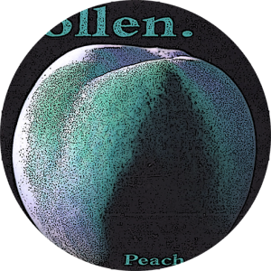
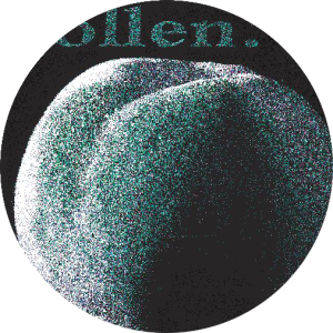
Some filters severely complicate our ability to properly replicate an image onto your garments. Looking for a distressed effect or to give your design an edge? Let us help! To ensure the design can be broken down into a screen printable format for separations, the artwork requires specifics or the end print will be compromised. This is vital when printing a multi-colored design. We don’t mean to be difficult, we just want to make sure the end result mimics your intentions.
Artwork is the heart of every print project

Scaling dpi

Posterized

Indexed

Halftones

Crowd Reactions
- 50% Say – Rad, here’s the PMS number(s)!
- 50% Say – I’m sorry… umm Pan-what?
Pro Definition: The Pantone Color Matching System is largely a standardized color reproduction system; as of 2019 it has 2161 colors. By standardizing the colors, different manufacturers in different locations can all refer to the Pantone system to make sure colors match without direct contact with one another.
Breakin’ it down: Do you want your artwork to be a specific color? Rad – we can do that!